Websites in Alaska built to sell
A good-looking website that does not sell is a cost. We judge every redesign by what happens afterwards: more inquiries, more orders and less waiting.
More than 200 clients trust us.
Web design and development for companies in Alaska: corporate sites and online stores made from scratch, easy to use and ready to sell.
Featured in the Spanish press
















And so on, past 200 clients.
A good-looking website that does not sell is a cost. We judge every redesign by what happens afterwards: more inquiries, more orders and less waiting.
2
designs per page, one for desktop and one for mobile. We do not build what you have not seen.
Design
3
numbers we check at launch: load speed, inquiries and sales.
What we measure
4
stages before launch, and at each one we show you the work before moving on.
Process
0
templates. Every website starts from its own design, made for your brand and for what you want the visitor to do.
Built to order
Custom designAnimation3DOnline stores
AlaskaUSAWorldwide
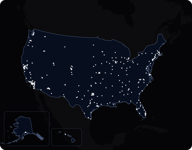
The Census Bureau counts 740,133 residents in Alaska for 2024. One city passes 100,000 people, and it has its own page.
Across an area this large, buyers compare you with firms from several cities at once. A site designed for your brand is easier to remember than a template shared with half of them. Our office is in Murcia, Spain, about 8,600 km (5,300 miles) away and usually 10 hours ahead of you. We meet by video call. If your business is in Washington, Oregon or Idaho, there is a page like this one for each.
Source: US Census Bureau, 2024 population estimates.
Three examples of web design in Alaska
A law firm website has ten seconds to earn trust: who you are, what kind of cases you take and how to speak to you today.
Courses, timetables, prices and a trial lesson to leave your details. Signing up should not take one step more than it needs.
A savings calculator, installations done in the area and a form that asks only for what is needed. That is how more survey requests come in.
A custom website starts long before anyone opens the design software. First you need to be clear about what you sell and to whom. Then about what should happen when somebody lands on the site.
A site map and a script for each page. It is the least showy part of the project and the one that weighs most on the result.
Typefaces, colors and photos chosen for your company. The aim is that someone would recognize your website with the logo covered up.
We use animation to explain things, as on this page: elements that move as you scroll down and help you follow what is being said.
We test on real phones as well as on the office computer. If the site feels slow on a mid-range one, we keep tuning it.
The site is born with the structure, the copy and the technical side that Google and AI assistants need to understand it. That way it does not have to be rebuilt a year later.
If you sell online, we build the whole shop. If you do not, you get a content panel to update the site yourself whenever you like.
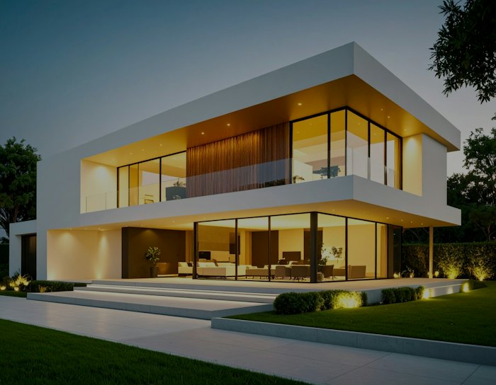
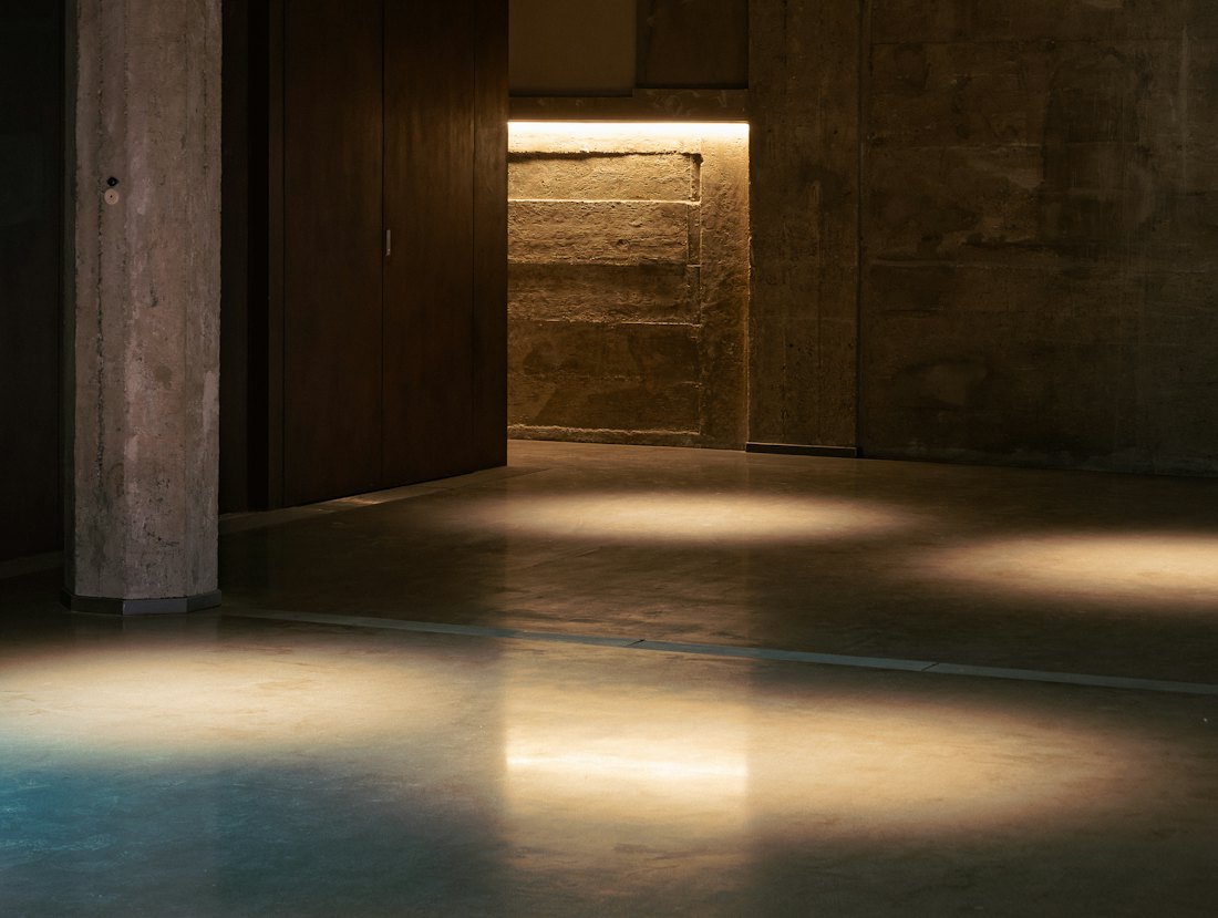
Two websites for the same architecture studio. The first could belong to anyone. The second shows its projects full screen and moves with you as you scroll.
Illustrative simulation with stock photographs. Every project has its own design, figures and timings.
A video call to understand your business, your customer and what you expect from the website. The structure comes out of that.
First the structure in gray, then the design with your brand. That way each thing is discussed at the right moment.
We develop the site and put the content in. You get a private link so you can watch it take shape.
We publish with the old addresses redirected, so the search positions you had are kept, and check that everything works.
5.0
34 Google reviews
“Friendly, effective and quick to sort things out. 100% recommended.”
“Without a doubt the best marketing decision I have made.”
“I am really happy with the guys at Vértigo, Jesús and Raúl.”
Can't find your question? Write to us and we'll reply within 24 hours.
Talk to the teamThere is no price list because no two projects are alike. Tell us how many pages you need, if you plan to sell online and how much animation you have in mind. Once we have talked it through, you get a written proposal with one closed figure for the whole job.
No. The design is always our own and always made for you. What changes from one project to another is the technology underneath: sometimes a well-known content management system is the sensible choice, and sometimes the site is better coded entirely to order.
Yes. We hand the site over with a simple panel for editing texts, images, products or blog posts, and we show you how to use it. For day-to-day changes you do not depend on us, and if you get stuck you can write to the team.
Yes. We build the whole shop: catalog, checkout, payment and shipping, with a panel for managing orders and products. We design it for the phone first, because that is where a great deal of buying happens now, and then adapt it to larger screens.
We look after them. Before publishing the new site we check which pages bring you visits and redirect the old addresses to the new ones, so that Google does not lose track. That is how the positions you already have are kept when the new website replaces the old one.
Not when they are done properly. We load those pieces after the main content and adjust them to the power of each device. This very page is built that way, so you can judge for yourself by opening it on your phone.
If you already have a website, we look at it and tell you what we would change. If you do not, we start from your idea. Either way you receive a clear proposal with no obligation.
Your new websiteNo obligation
RequestWe will get back to you as soon as possible.